I finally got round to imaging this object, and this is the first time I have attempted to combine Ha and OIII all in the same RGB image. I am not sure about blending the OIII with the two separate G and B channels - I simply placed the same amount of OIII in each, which made the whole thing a bit too green for my liking, but I did not know that until I had got further along in the processing, and by that stage I did not want to go back and redo it! I then did some adjusting later, and have got it a bit better, but maybe there is a formula or method of how to mix the OIII with the G and B channels better and get a better blue hue? Anyway, that fact, at present, eludes me, and I only have so much head space to manage these things. Thanks everyone and have a good day...
Pier 7 is a William Optics FLT132 F5.6 APO, with a QSI 660-WSG Mono CCD camera, all on a Paramount MX mount. I was able to use from the data provided, 24 reds, 23 blues, 20 greens and 12 Has, and 43 OIIIs, each at 5 minutes long exposure time, and thus an integration time of 10 hours and 10 minutes.
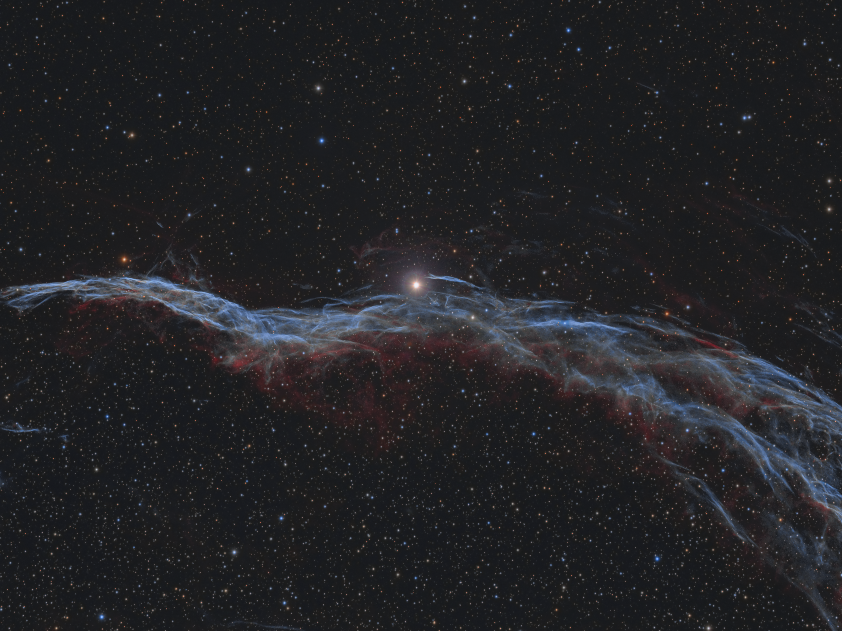
And a slightly brighter one for those who prefer such things...

Pier 7 is a William Optics FLT132 F5.6 APO, with a QSI 660-WSG Mono CCD camera, all on a Paramount MX mount. I was able to use from the data provided, 24 reds, 23 blues, 20 greens and 12 Has, and 43 OIIIs, each at 5 minutes long exposure time, and thus an integration time of 10 hours and 10 minutes.
And a slightly brighter one for those who prefer such things...

- Page :
- 1
There are no replies made for this post yet.
Be one of the first to reply to this post!
Be one of the first to reply to this post!

Proud to use
Resources
Company Details:
Roboscopes
802 Kingsbury Road
Birmingham
B24 9PS
United Kingdom