
Hey
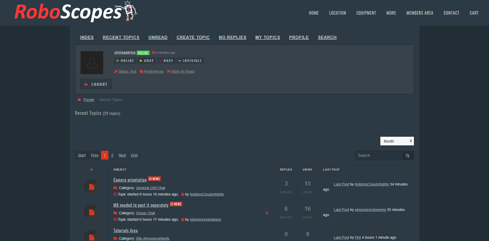
So I wanted to talk about the forum layout, and in particular the amount of space at the top, assigned to info we don't need to see,
Most of the info we need to see is below the fold, and there's a lot of wasted space, that could be removed with some edits of the template.
Here's what it looks like now;
Here's what it could look like:
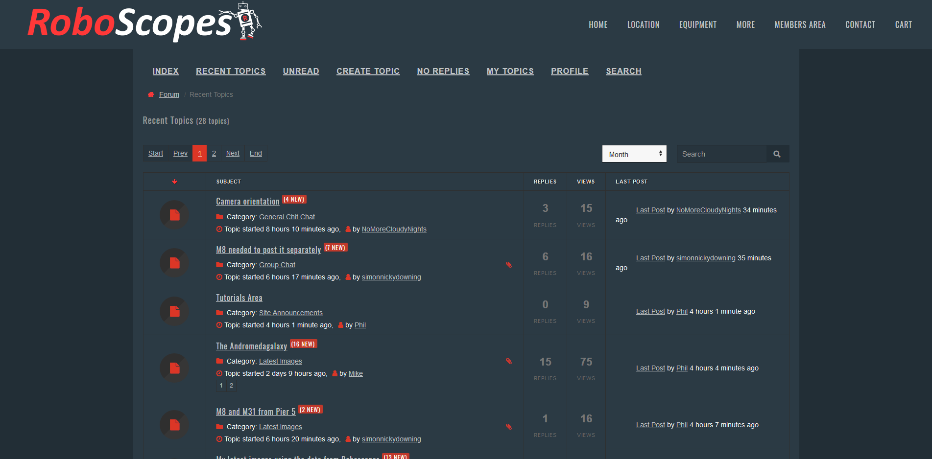
And if the site menu wasn't sticky, it would free up more space.
Cheers
Chris
So I wanted to talk about the forum layout, and in particular the amount of space at the top, assigned to info we don't need to see,
Most of the info we need to see is below the fold, and there's a lot of wasted space, that could be removed with some edits of the template.
Here's what it looks like now;
Here's what it could look like:
And if the site menu wasn't sticky, it would free up more space.
Cheers
Chris


- Page :
- 1
There are no replies made for this post yet.
Be one of the first to reply to this post!
Be one of the first to reply to this post!