By chrispatrick on Tuesday, 16 June 2020
Posted in Suggestion Box
Replies 4
Likes 0
Views 1.4K
Votes 0
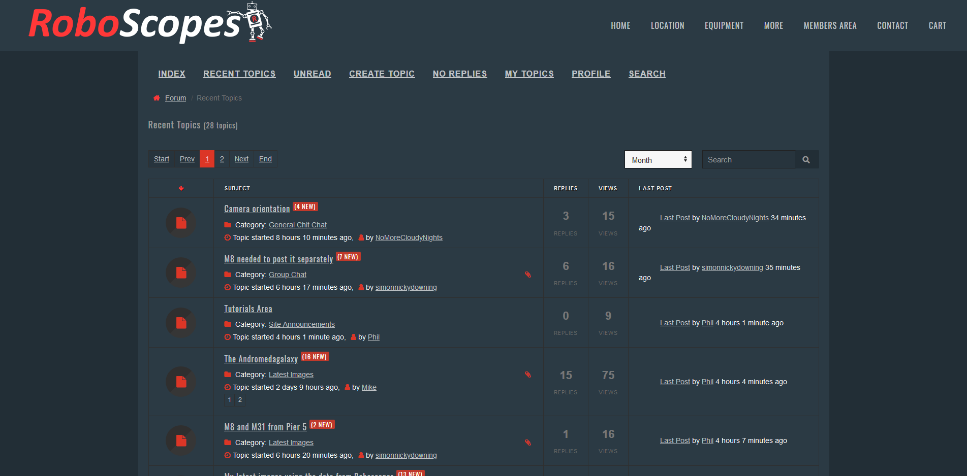
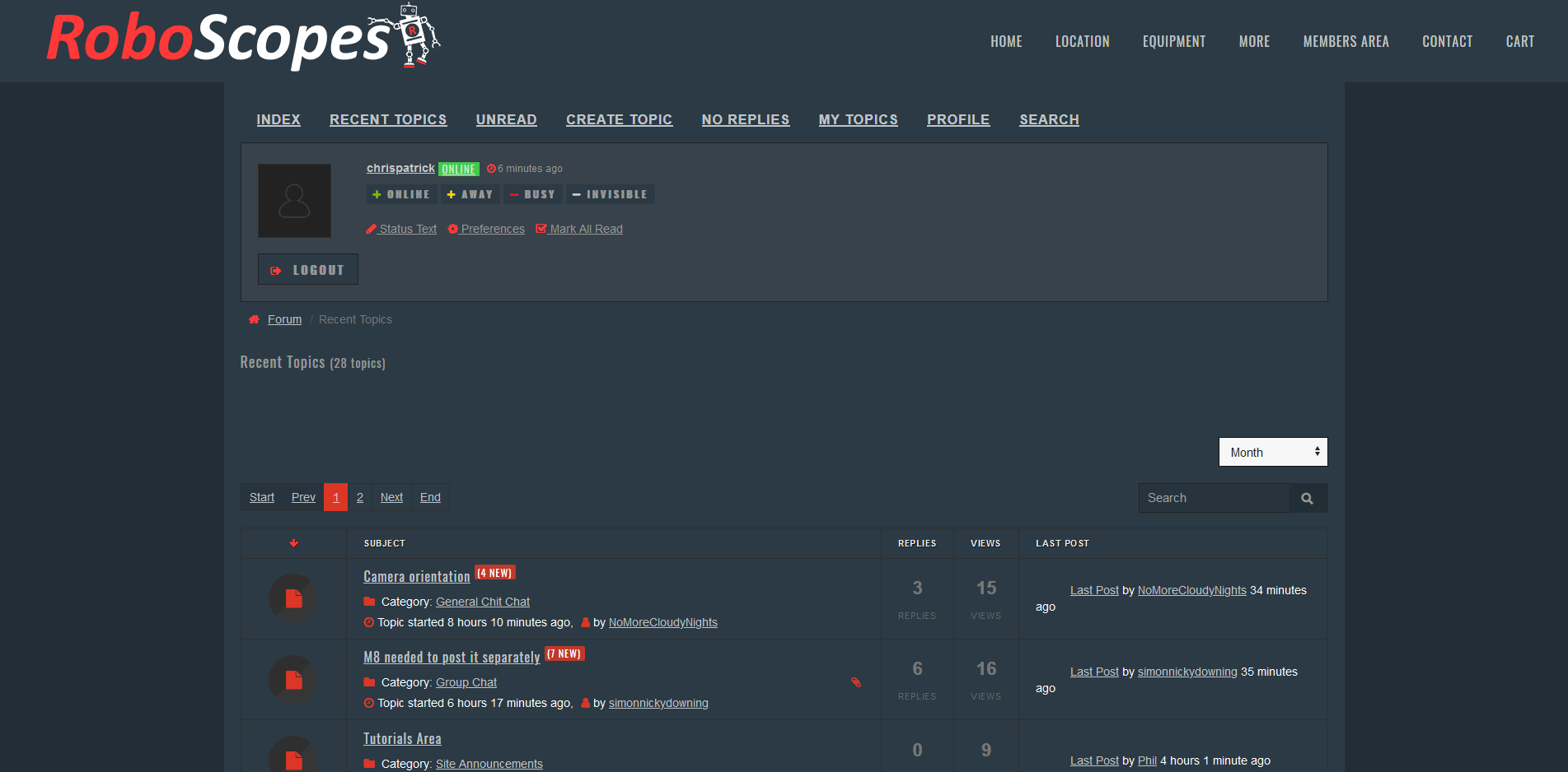
Hey So I wanted to talk about the forum layout, and in particular the amount of space at the top, assigned to info we don't need to see, Most of the info we need to see is below the fold, and there's a lot of wasted space, that could be removed with some edits of the template. Here's what it looks like now; Screenshot_2020-06-16 Recent Topics.png Here's what it could look like: Screenshot_2020-06-16 Recent Topics(1).png And if the site menu wasn't sticky, it would free up more space. Cheers Chris
Hi Chris, Me and Steve both agree. I will get these changed asap. Thanks for the suggestion. Phil.
·
3 years ago
·
0 Likes
·
0 Votes
·
0 Comments
·
That's better... I don't have to buy a bigger laptop now Cheers Chris
·
3 years ago
·
0 Likes
·
0 Votes
·
0 Comments
·
PMSL Still, its more money for imaging
·
3 years ago
·
0 Likes
·
0 Votes
·
0 Comments
·
No problem at all, I am currently compiling a list of things to look at, as well as making the forum mobile friendly where possible. if you spot anything else please let me know.
·
3 years ago
·
0 Likes
·
0 Votes
·
0 Comments
·
View Full Post